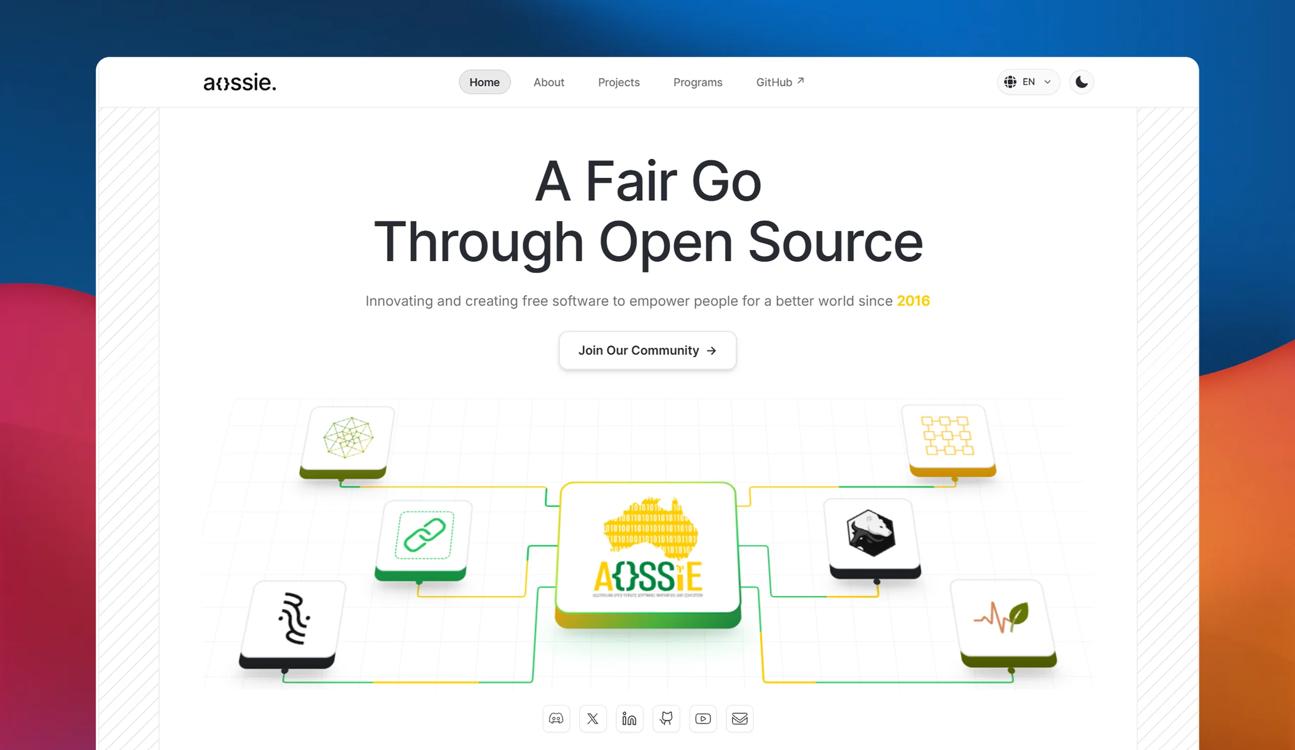







A brand kit (logos, colour system, typography, templates), the AOSSIE website and six project sites (Resonate, PictoPy, Zplit, MoveYourBody, Perspective AI, Social Share Button), the Support Us Button and Social Share Button libraries published to npm, and an upgraded Next.js template every future AOSSIE site can start from.
AOSSIE builds technically strong software, but its web presence didn't show it. Projects had no clear entry point for end users, logos lived as PNGs, colours changed from site to site, and many sites had no i18n, dark mode, metadata, tests or CI. A project without a welcoming front door loses its first chance to connect with users, however good the software behind it is.
I treated the summer as one system rather than eight pages: a shared brand and template first, then the same pipeline for every site, from Figma (desktop, mobile, dark and light) to architecture, WCAG 2.2, responsive layouts, SEO and Open Graph, Lighthouse and deployment. Every repo then went through a full quality pass: tests, security reviews, peer audits and documentation.
Highlights
Twenty-two weeks, eight projects and three organisations (AOSSIE, Stability Nexus and Djed Alliance). Below is what shipped: pick a site to watch it live. The sections after it show how the system came together and the decisions behind it.
The Problem
At the start of 2026, every AOSSIE site had been built on its own, by different people, at different times. The result was a web presence that undersold the software and made every new site start from zero.
- No front door
Pages spoke to contributors, not users. MoveYourBody had no website at all.
- No brand system
PNG logos, and colours and type that changed from site to site.
- Missing basics
No i18n, dark mode, Open Graph, tests or CI on many sites.
- Starting from scratch
The template lacked the i18n, theming and export setup a site needs.
- Not ready to share
The share and support widgets had no tests or leaked styles.
- No path to users
Perspective AI could not be deployed or safely face the public.
The deeper problem
Pages built without UX thinking or a plan for maintenance go generic, stale or unused. So the goal was never more pages; it was a system: sites that drive adoption, need little upkeep, and serve both end users and contributors.
The Proposal
My proposal, "Engineering i18n and l10n ready, WCAG 2.2 compliant and optimized landing pages for AOSSIE", took AOSSIE's landing-page idea further than visuals. Each page had to drive real adoption, need little upkeep, and serve both end users and contributors. AI can generate a page in minutes; without UX thinking and a plan for maintenance, it goes generic, stale or unused.
Six deliverables, on every landing page
From the proposal's deliverables chart
- 01Figma designs
- Branding
- UI screens
- Site content
- UX writing
- Design system
- Dual theme
- 02i18n + l10n
- next-intl architecture
- Scalable structure
- 2+ languages
- 03WCAG 2.2 AA
- Perceivable
- Operable
- Understandable
- Robust
- 04Development
- Responsive layouts
- Hero + CTA
- Project overview
- Metrics + features
- Socials + footer
- 05Optimization
- Performance
- SEO
- Security
- Custom domains
- 06Future-proofing
- Handover guides
- Documentation
- Bug fixes + patches
- Dependency upkeep
The plan
20 weeks, 350 hours, one site every two to three weeks. Each site ran the same three-step cycle, and the community bonding period went to the brand, the design system and a component blueprint, so the cycle could start fast.
- 1STEP 1Design + architecture
Final Figma (desktop, mobile, light, dark), locked flows and content, then i18n, theming and SEO set up first.
- Figma
- next-intl
- next-themes
- 2STEP 2Build
Every section, localised and responsive, with keyboard navigation, focus states and contrast checked as it is built.
- WCAG 2.2
- i18n
- Responsive
- 3STEP 3Optimise + ship
Assets, Open Graph and sitemaps, a Lighthouse 90+ target on every pillar, user testing, then deployment.
- Lighthouse
- SEO
- Deploy
Proposed vs shipped
The site list changed with my mentors during the summer: the AOSSIE website, MoveYourBody and Support Us Button came in, and a DebateAI gateway design took Djed Alliance's slot. Every commitment still landed, and so did work the proposal never asked for.
| Proposed | Shipped |
|---|---|
| 6 to 8 end-to-end websites in 20 weeks | 7 sites live, and Perspective AI built, in 22 weeks |
| Figma designs: desktop, mobile, light and dark | Every site, plus the AOSSIE brand kit and 10+ SVG logos |
| i18n and l10n with next-intl, 2 languages | English and Hindi on every site; aossie.org in 13 |
| WCAG 2.2 Level AA | AA contrast in both themes, keyboard focus, reduced motion |
| Lighthouse 90+ on all four pillars | 92 to 100 everywhere; 100 on Best Practices and SEO |
| Sitemaps, robots.txt, Open Graph, JSON-LD, llms.txt | All seven sites, with 1200×630 preview images |
| Handover docs and contribution guides | README, CONTRIBUTING, AGENTS.md and Brand.md in every repo |
| Not in the proposal | 2 npm packages, 2,150+ tests, 8 security reviews, a Next.js template |
Design Foundations
Eight projects could easily have become eight different ways of doing the same thing. So before the second site, I fixed one plan for everything a page needs and applied it to every repo: how it speaks every language, themes, stays accessible and fast, ships, and stays easy for the next contributor, human or AI.
- Internationalisation (i18n)
next-intlwith the locale in every URL. English and Hindi on every site, 13 languages on aossie.org. Catalogue tests fail the build on a missing key or placeholder. - Localisation (l10n)
aossie.org sets
dirper language for right-to-left Arabic and Urdu, mirrors directional icons, and loads Noto fonts for Arabic, Bengali and Devanagari scripts. - SEO
Per-page metadata, canonical and
hreflanglinks, a sitemap with alternates,robots.txt, JSON-LD and 1200×630 preview images for every link shared. - Agentic readiness
llms.txtand.well-known/on every site. MoveYourBody addsopenapi.jsonand/api/info, kept in sync with the site by a test.
One design system, every site
The brand lives in Figma; the design system lives in code. Components name what a colour is for, never which colour it is, so both themes come from one set of components and a palette change is one edit in one file.
- 1FIGMAStyles + components
Colour and type styles per project, reusable components, light and dark frames side by side.
- Type scale
- Colour roles
- 2TOKENSSemantic CSS variables
One name per role (background, foreground, border, button), with a light and a dark value.
- Tailwind v4 @theme
- :root / .dark
- 3CODEComponents
Components use token classes, so a theme or brand change never touches a component.
- bg-background
- text-foreground
- 4DOCSBrand.md
The palette, roles and type written down in every repo, for people and AI agents alike.
- brand/ folder
- Contrast ratios
@import "tailwindcss"; @custom-variant dark (&:where(.dark, .dark *)); @theme { /* --- BRAND PALETTE --- */ --color-brand-yellow: #FFC100; --font-sans: var(--font-inter), var(--font-devanagari), ui-sans-serif, system-ui, sans-serif;} /* --- SEMANTIC COLOR TOKENS (excerpt) --- */ /* LIGHT MODE (Default) */:root { --background: #F5F5F5; --foreground: #1C1C1C; --foreground-muted: #4D4D4D; --heading-highlight: #121212; --border: var(--color-neutral-200); --button-primary-bg: transparent; --button-primary-text: #121212; --card-bg: rgba(255, 255, 255, 0.85);} /* DARK MODE */.dark { --background: #101010; --foreground: #D3D3D3; --foreground-muted: #85878E; /* was #7F8188; +2 L* so 11px labels reach 4.5:1 on the card gradient's #202020 end */ --heading-highlight: var(--color-brand-yellow); --border: var(--color-neutral-800); --button-primary-bg: #FFFFFF; --button-primary-text: #101010; --card-bg: rgba(22, 22, 22, 0.85);}Components never say dark:bg-black. They use semantic tokens like bg-background and text-foreground, and .dark swaps the values underneath, so a palette change is one edit in one file, and both themes are checked against WCAG AA contrast.
Lighthouse
Mobile runs on simulated slow 4G: every site scores 100 on Best Practices and SEO, and 96 to 100 on Performance.
| Site | Performance | Accessibility | Best practices | SEO |
|---|---|---|---|---|
| aossie.org | 98 | 92 | 100 | 100 |
| resonate.aossie.org | 99 | 100 | 100 | 100 |
| zplit.aossie.org | 97 | 95 | 100 | 100 |
| move.aossie.org | 96 | 96 | 100 | 100 |
| pictopy.aossie.org | 96 | 96 | 100 | 100 |
| social-share-button.aossie.org | 99 | 97 | 100 | 100 |
| Support Us Button demo | 100 | 100 | 100 | 100 |
Brand Identity
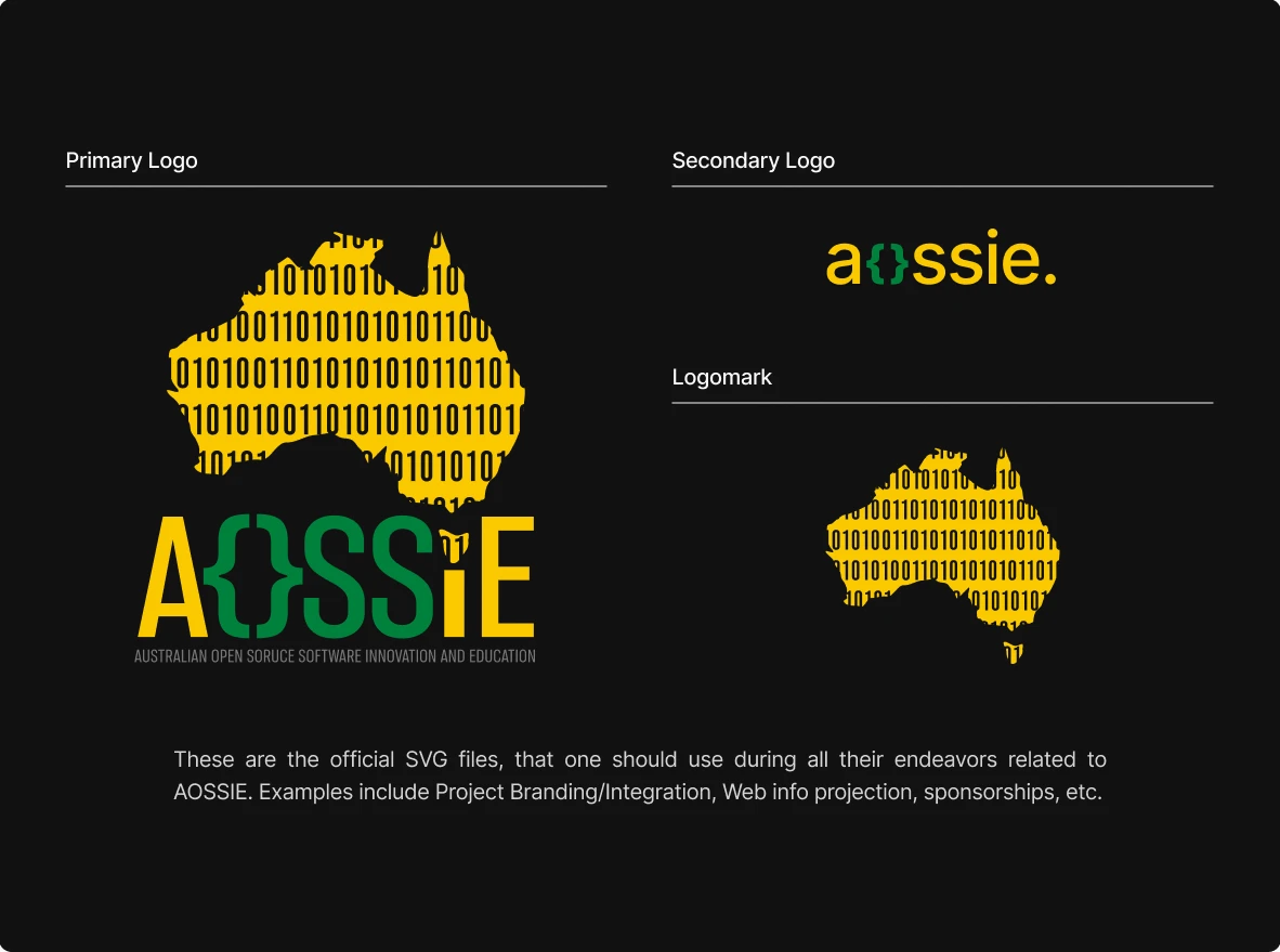
Before building any site, AOSSIE needed one source of truth for its brand. I set up an AOSSIE community account on Figma, organised the files into a Brand Kit and a Logos Hub, and brought the essentials into the org's Info repo.
Colour and type
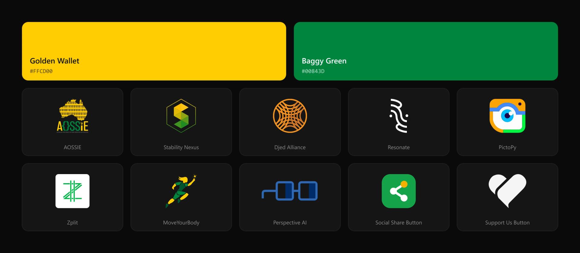
The palette is built around Golden Wallet #FFCD00 and Baggy Green #00843D, Australia's national colours, with neutrals for both themes. Inter carries everything, from a 72px display size down to 14px captions, so any project can fall back to it.
Logos recreated as SVG
More than ten logos were redrawn as clean SVGs, including Fate, CarbonTracker, Chainvoice, OrgExplorer, Zplit, Djed and Djed Alliance, plus a new logo for the Skills Ecosystem. They replaced the PNGs across AOSSIE, Stability Nexus and Djed Alliance sites.
Motion
An animated intro built from the brand colours and the logo, for videos, events and social media.

How I Created the Template Repo
At the start of the summer, AOSSIE's Next.js template was a bare create-next-app: a root app/ folder, default fonts and metadata, and a CI that only linted and built. I had already solved i18n, themes, SEO and static deploys in my own webpage-starter, so I upstreamed it into Template-Repo-NextJS in four pull requests. Every site after that started with the setup already done.
- 1BEFOREcreate-next-app
Pages at the root, default fonts and metadata, an empty config, and lint plus build in CI.
- Next.js
- No i18n
- No theming
- 2PR #11The architecture
Locale routing, English and Hindi catalogues, theme and language switchers, sitemap, robots.txt, llms.txt, Brand.md and AGENTS.md.
- next-intl
- next-themes
- 38 files
- 3PR #12Static export
A pure static build with a root page and the brand folder in public/, so any site deploys to GitHub Pages.
- output: export
- public/brand
- 4PR #13 + #14Docs + deploys
MAINTAINERS, the best-practices checklist, README fixes, Pages workflow triggers and a static message catalogue.
- Pages workflow
- Checklist
What it changed
Zplit's first commit was a "website kickstart based on Template-Repo-NextJS", and Resonate and PictoPy were moved onto the same structure. Fixes found on one site, like the root route that keeps link previews on a static export, went to all of them.
import type { NextConfig } from "next";import createNextIntlPlugin from "next-intl/plugin";import path from "path"; const withNextIntl = createNextIntlPlugin("./src/i18n/request.ts"); const nextConfig: NextConfig = { output: "export", images: { unoptimized: true, }, turbopack: { root: path.resolve(__dirname), },}; export default withNextIntl(nextConfig);One config makes every site a pure static export: no server, so it deploys to GitHub Pages for free, and next-intl is wired in at build time.
Resonate
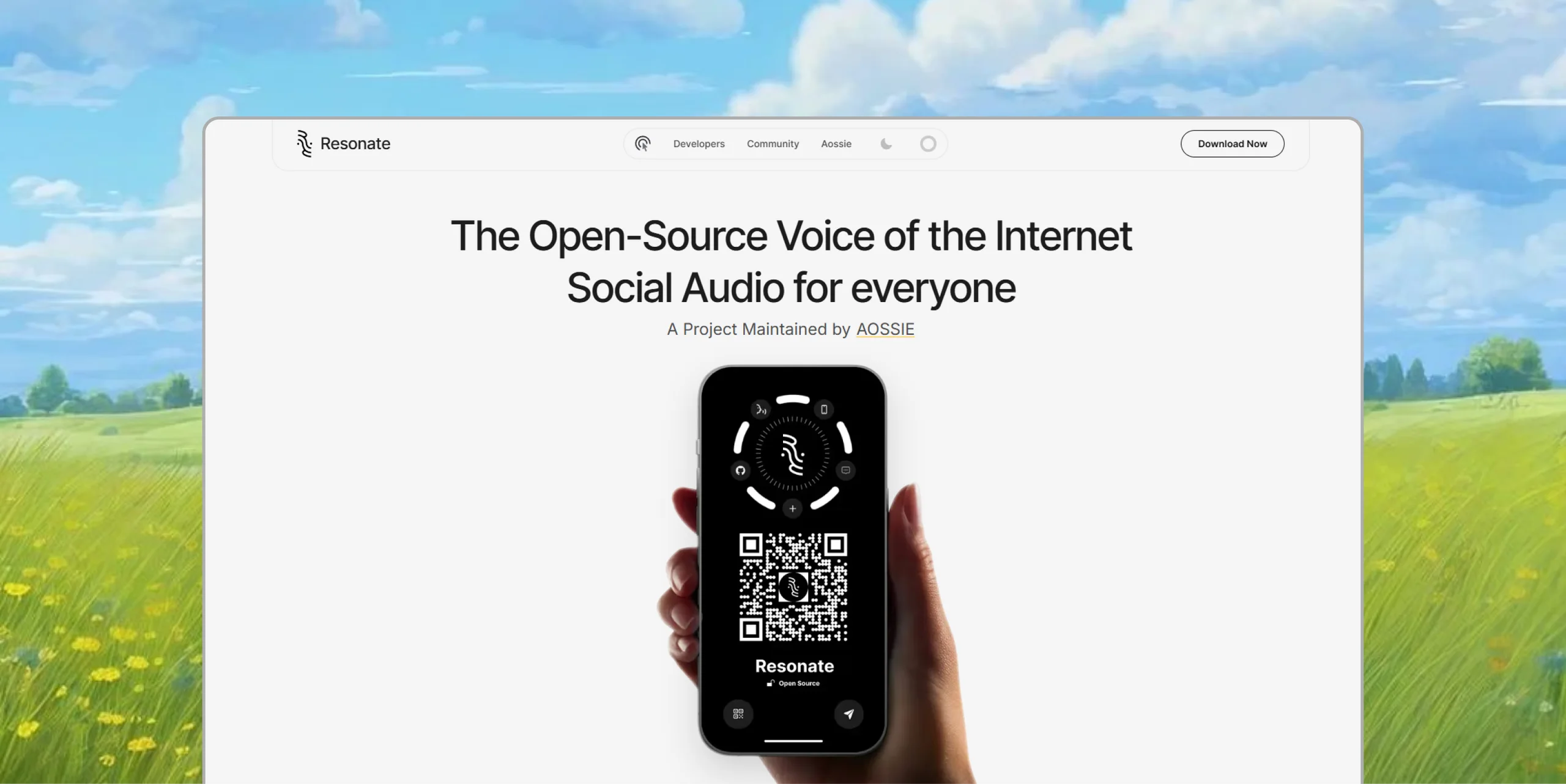
Resonate is an open-source social audio app, and its site is where the playbook started. It became the reference every later site followed: components localisable from day one, a download modal that detects the visitor's OS, and a scroll-driven phone that travels down the page. Shared room links became deep links that open the app or fall back to the Play Store.
User flow
Every navbar item, section and element mapped to where it takes the visitor: down the page, into the QR code modal (with a device switcher and store links), or off the site. Coral pills are redirections.
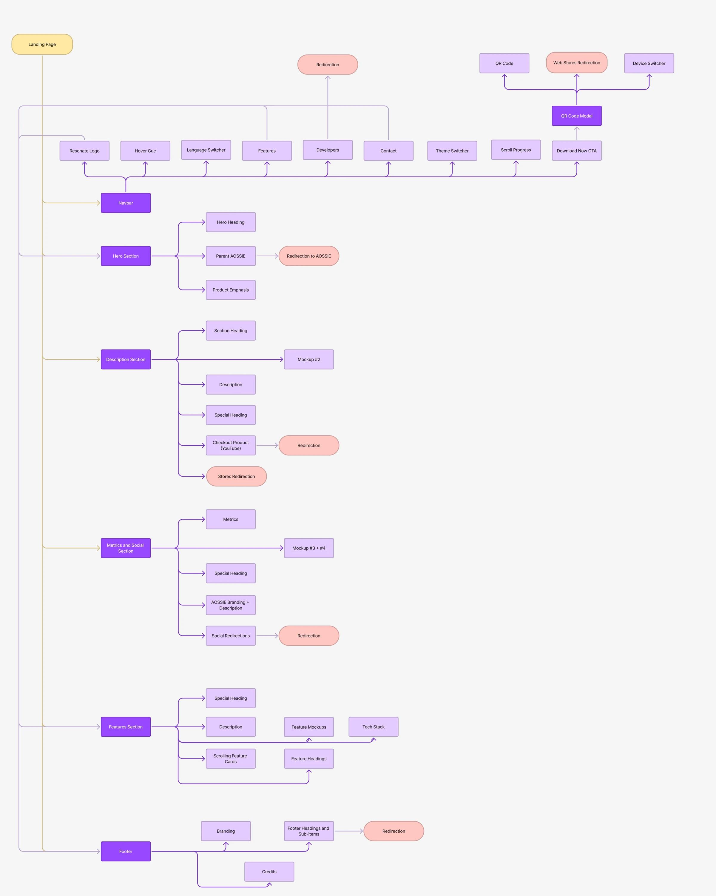
Context-aware download
The flow's Download Now path, in code: Android goes straight to the Play Store, while iOS and desktop get the QR code. It finished the summer with 275 tests covering 99.6% of the code base.
const handleDownloadClick = useCallback(() => { const userAgent = navigator.userAgent || navigator.vendor || ("opera" in window ? (window as unknown as { opera?: string }).opera : undefined) || ""; // Detect Android (excluding smart displays like Nest Hub/Chromecast) const isAndroid = /android/i.test(userAgent) && !/CrKey/i.test(userAgent); // Detect iOS and iPadOS (including modern iPads that report as Macintosh) const isIOS = /iPad|iPhone|iPod/.test(userAgent) || (navigator.platform === 'MacIntel' && navigator.maxTouchPoints > 1); if (isAndroid) { window.open(PLAY_STORE_URL, "_blank", "noopener,noreferrer"); } else { // iOS opens the modal on its "coming soon" tab (no App Store listing yet); desktop, Nest Hub, // Fuchsia and other non-mobile OSes get the QR code modal setDownloadDevice(isIOS ? "ios" : "android"); setIsDownloadModalOpen(true); } }, []);The proposal's context-aware download: Android goes straight to the Play Store, while iOS and desktop get the QR code modal. Modern iPads report themselves as a Mac, so touch support is checked too.
Support Us Button
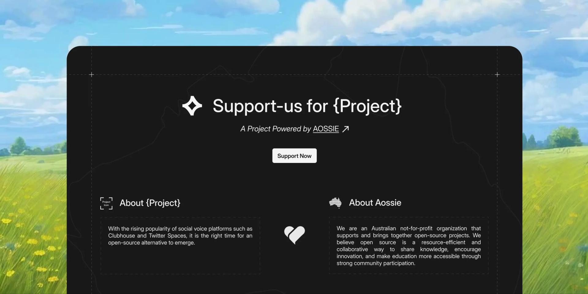
A Support Us section that any AOSSIE project can drop into its own site. The hard part is that it has to look at home on someone else's page: it reads the host's font, background and contrast, adapts to them, and re-checks when the host switches theme.
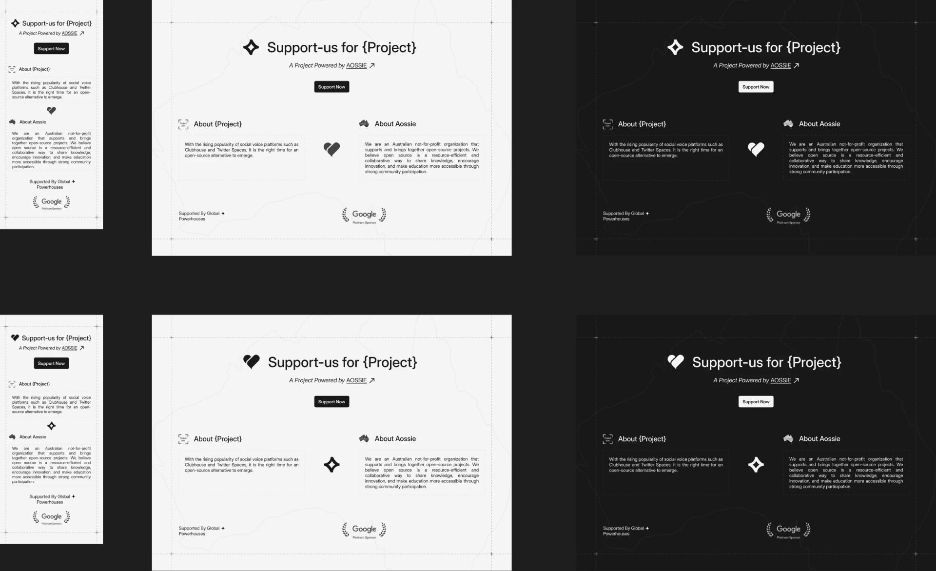
Being a good guest
Release 2.3.0 scopes all of its CSS to the component, so importing it never restyles the host page. That change is what let every AOSSIE site adopt it, and it ships with 148 tests at 100% statement coverage, published to npm as @aossie-org/support-us-button.
AOSSIE Main Website
The org's website is the front door for every contributor, GSoC applicant and partner, and it now speaks 13 languages, including right-to-left Arabic and Urdu. Its projects directory is built from verified data across AOSSIE, Stability Nexus and Djed Alliance.
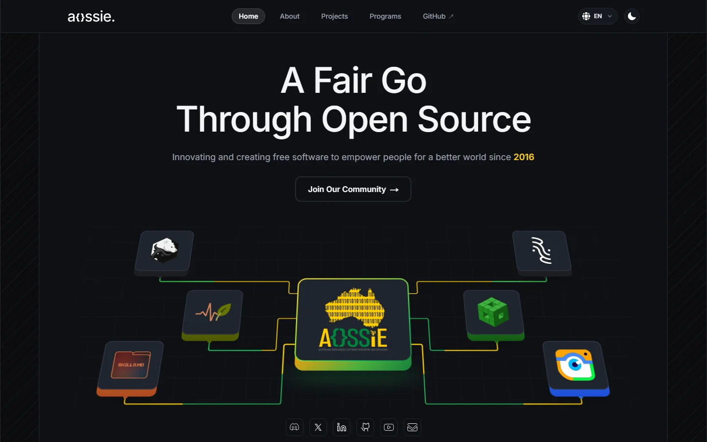
Thirteen languages, kept correct
Content tests fail the build on any missing key or placeholder, and an agent skill keeps project translations in sync, so adding a project can't silently break the other 12 languages.
Found on the way
An indexing bug had given every sub-page the home page's canonical URL, telling search engines to ignore them. Each page now has its own canonical, matching the sitemap.
PictoPy
PictoPy is a desktop photo gallery, so its site has one job: get the right installer onto the visitor's machine. It moved from Vite to the shared template with a full redesign, and the release closed 12 issues.
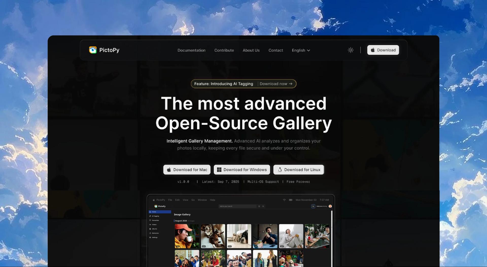
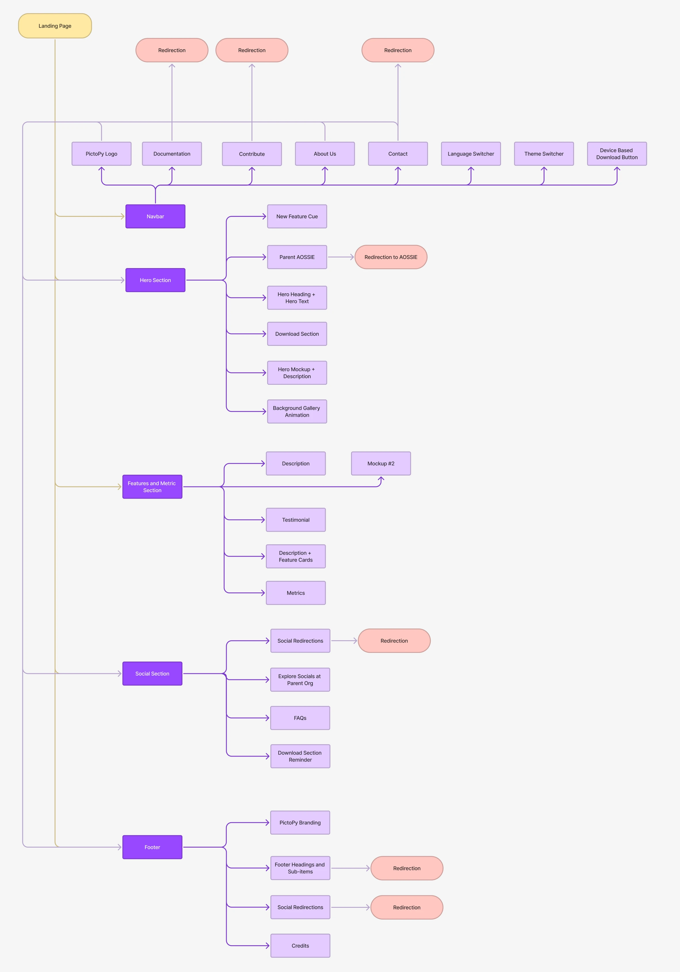
User flow
The device-based download button sits in the navbar and comes back in the hero and at the end of the page as a download reminder, so the visitor is never more than a glance from it.
The right build, always current
Download buttons detect the platform and resolve the latest GitHub release, so the link never goes stale. The logic is a pure function, covered by unit and property tests.
export type Platform = "mac" | "windows" | "linux"; const MOBILE_USER_AGENT = /android|iphone|ipad|ipod|mobile/i; // Used when the user agent is unavailable (e.g. during prerendering)export const DEFAULT_PLATFORM: Platform = "windows"; export function isMobileUserAgent(userAgent: string): boolean { return MOBILE_USER_AGENT.test(userAgent);} /** * Maps a user agent to the desktop build to offer. Mobile devices get no * desktop platform: Android UAs also contain "linux" and iPhone/iPad UAs * contain "mac", so they must not fall through to the desktop checks. */export function detectPlatform(userAgent: string): Platform | null { const ua = userAgent.toLowerCase(); if (isMobileUserAgent(ua)) return null; if (!ua) return DEFAULT_PLATFORM; if (ua.includes("mac")) return "mac"; if (ua.includes("win")) return "windows"; return "linux";}PictoPy is a desktop app, so its button offers the right build for the visitor's OS. It's a pure function, so it's covered by unit and property tests; phones never get a desktop installer.
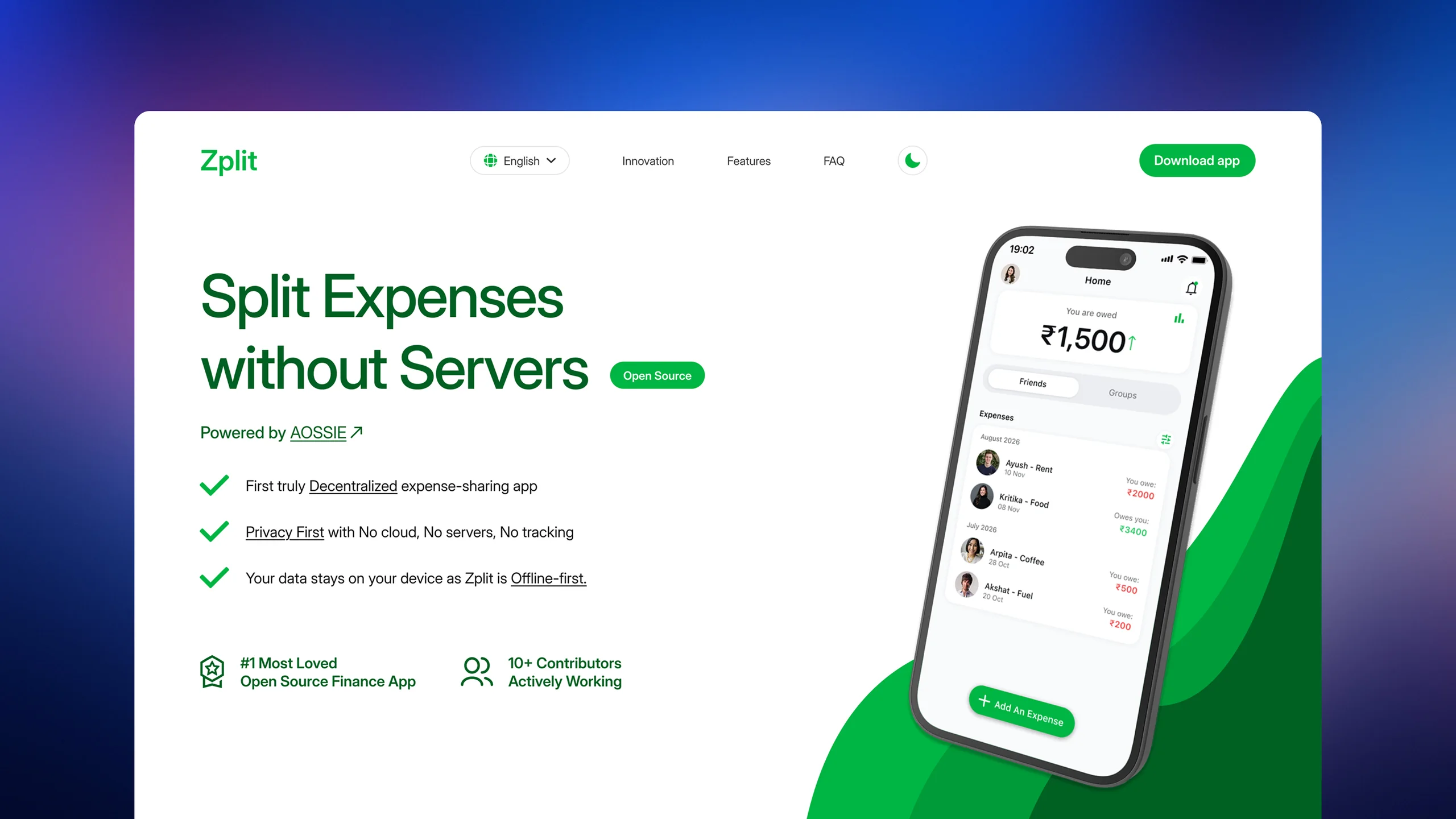
Zplit
Zplit splits expenses without servers, so its site leans into play: animated app screens, an interactive FAQ, an animated mesh footer and a tech-stack mini game. It was the first site kicked off from the new template.
A bug that only lived in CI
GitHub's configure-pages action was silently rewriting `next.config.ts` and breaking the i18n setup in production. My first fix treated the symptom; the second found the cause. Since then I read the build logs before patching.
Perspective AI
Perspective AI was a 0 to 1 rebuild of both frontend and backend. Readers go from pasting an article to balanced perspectives, a bias meter, fact checks and chat, in English and Hindi. The frontend is merged and builds as a static site; launch waits only on hosting the backend.
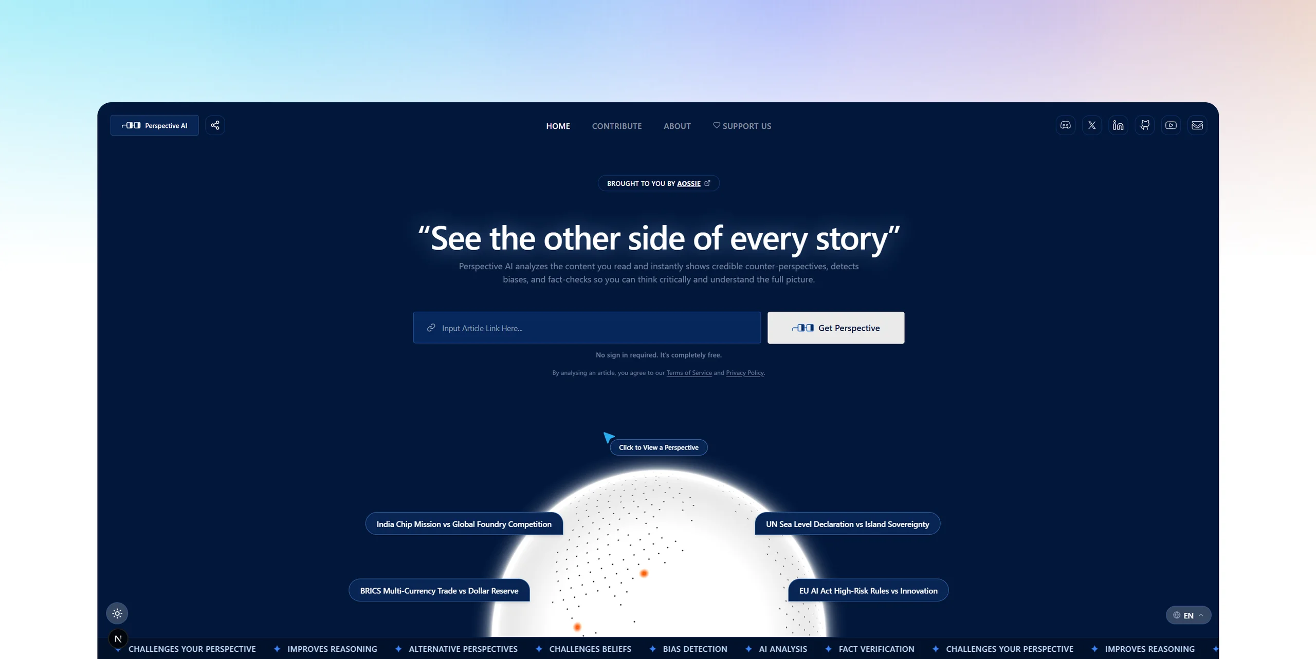
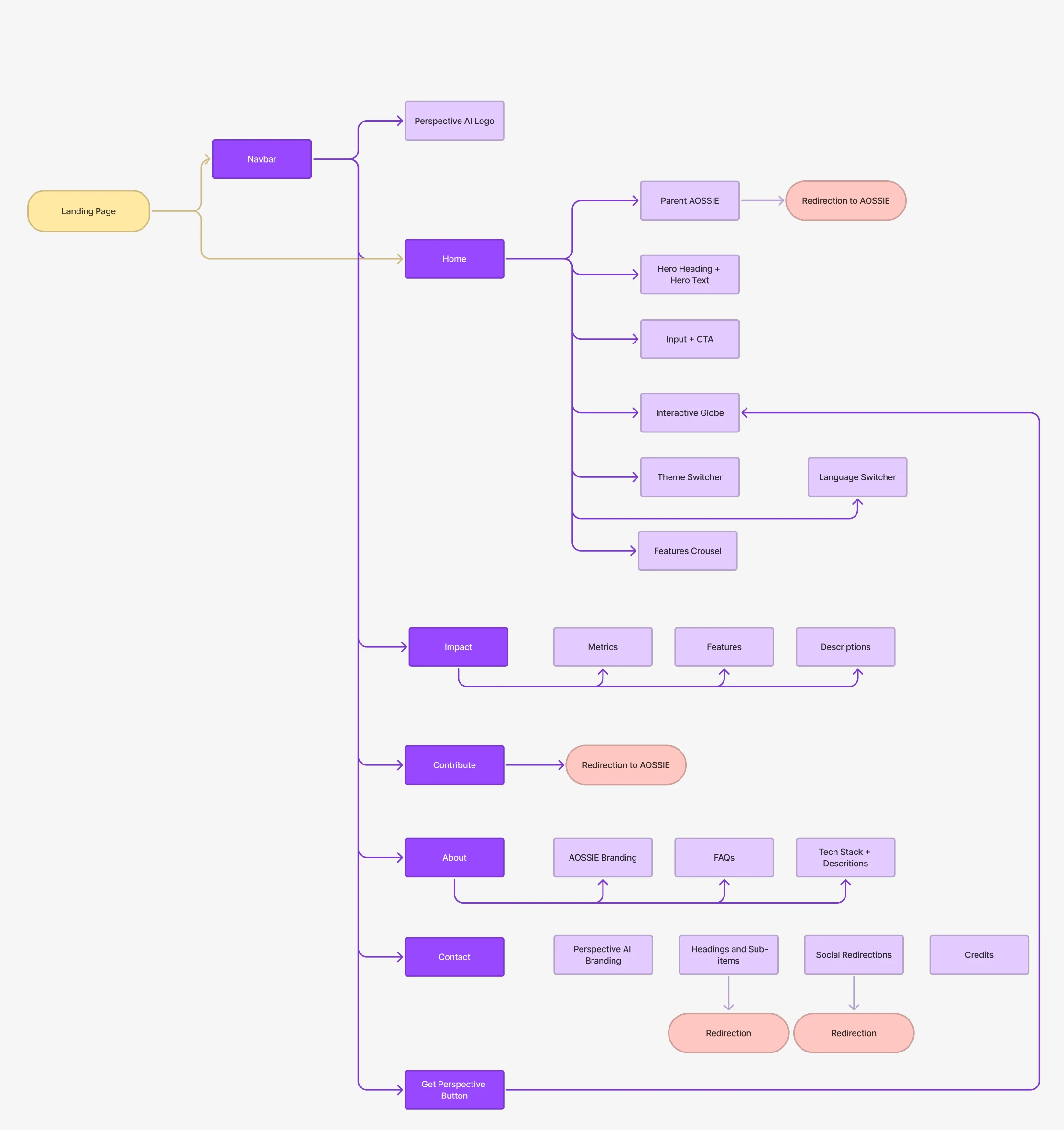
User flow
Unlike the other sites, Perspective is a web app, so its navbar is the product: Home, Impact, Contribute, About and Contact, with the Get Perspective button looping back to the input on the interactive globe.
Safe to put in front of the public
The backend fetches any article URL it's given, so the security review's server-side request forgery finding mattered most. A new backend suite of 229 tests (99.7%) runs in its own CI.
def validate_public_url(url: str) -> str: parts = urlsplit(url) if parts.scheme.lower() not in ALLOWED_SCHEMES or not parts.hostname: raise UnsafeURLError("Only http and https URLs are allowed.") try: port = parts.port or (443 if parts.scheme.lower() == "https" else 80) infos = socket.getaddrinfo(parts.hostname, port, proto=socket.IPPROTO_TCP) except (ValueError, socket.gaierror) as e: raise UnsafeURLError("The URL's host could not be resolved.") from e addresses = [ipaddress.ip_address(info[4][0].split("%", 1)[0]) for info in infos] # Python counts multicast ranges (224.0.0.0/4, ff00::/8) as global, so they are rejected explicitly if not addresses or any(not address.is_global or address.is_multicast for address in addresses): raise UnsafeURLError("The URL points to a private or reserved address.")Perspective fetches any article URL it's given, so the security review's SSRF finding mattered most: only public http(s) hosts are allowed, every redirect is re-checked, and the connection is pinned to the validated address.
MoveYourBody
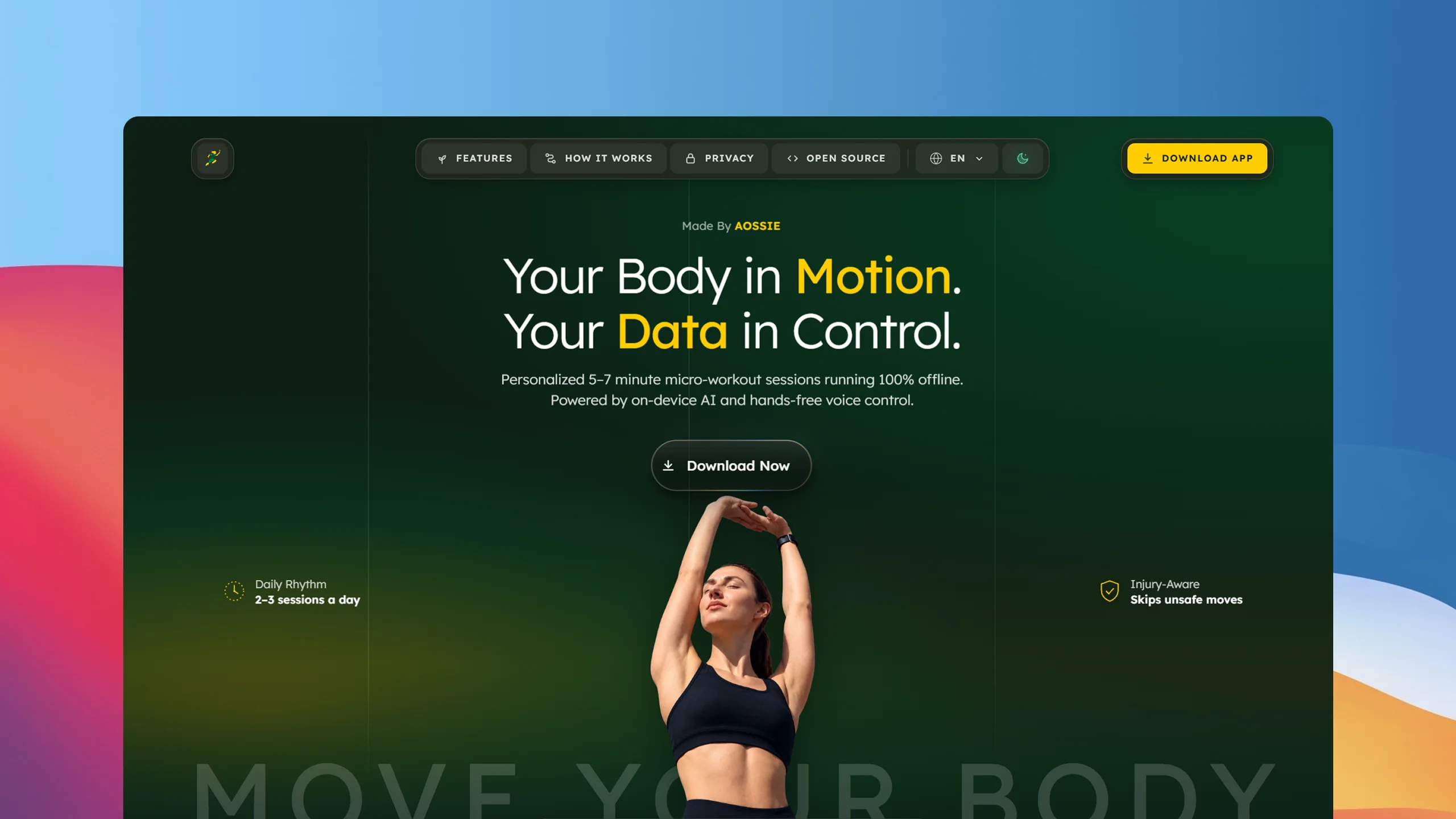
MoveYourBody had no website at all, so this one started from a blank Figma page. It feels alive without an animation library: CSS motion that pauses off-screen, the app's screens rebuilt in code rather than pasted in as screenshots, and a WebGL "liquid metal" download button.
Built for agents too
Besides llms.txt, the site publishes openapi.json and /api/info, kept in sync with the page by a test, and its robots.txt welcomes AI crawlers. It ships with 260 tests at 99.7%.
Challenges
The hardest problems were rarely in the design. They showed up between the design and production: static hosting, CI and the sheer breadth of eight projects.
Static export vs i18n and SEO
GitHub Pages can't run a server, but i18n routing assumes one, so bare domains exported as empty pages with no link preview. A small root route now ships the default locale's full metadata and redirects instantly.
Deploys that broke only in CI
A Pages action silently rewrote the Next.js config on one site; a stale config file overrode the real one on another. The fix was the same: read the build logs and config precedence instead of patching symptoms.
Eight projects, one person
Re-solving i18n, themes, SEO and CI for every site wasn't sustainable. The template and design tokens made each site faster than the last, and two-week blocks with weekly public updates kept all eight on schedule.
Reflection
This summer I went from designing in Figma to owning a whole web presence: brand, sites, libraries and the systems that keep them healthy. The work I'm proudest of is the least visible: the shared foundation that lets the next contributor start where I finished.
What I learned
- Designing a brand system that scales across products, with implementation in mind.
- Next.js static export with i18n, RTL locales and SEO that crawlers actually read.
- Test suites that cover a whole code base, CI/CD, and building and publishing npm packages.
- Writing PRs that are easy to review, and documenting for the next contributor.
create
fun
things together


Social Share Button
A zero-dependency share button for WhatsApp, X, LinkedIn, Telegram and more, with snippets for HTML, React, Preact and Qwik. It's a library, so its website doubles as its test bench: the site always demos the library from the same commit.
The wireframe
Most visitors are copying code, and many are new to it. So the framework picker reveals only the steps for that framework, every block gets copy to clipboard, tooltips explain the technical terms, and the navbar's Share uses the library itself.
From no tests to a release gate
The library had no tests before the summer; it now has a suite with property-based tests that gates every npm release. Release 1.1.0 closed an XSS path and added a
labelsoption, which is how the Hindi pages of every AOSSIE site translate it.