
Loading video...
INDUSTRY
Tech-Consulting
TECH STACK
Design Tool
Figma
At UIX Labs ( A firm that builds Tech Products for other companies ), I worked on improving the experience for their high-profile clients by building two things from scratch, a web app for tracking employees and projects to streamline internal processes, and a case study template for showcasing completed projects on their website, designed to be reused across all future work.
ROLES
UI/UX Designer
Product Manager
COLLABORATORS
Designer: Rahul
Co-Founder: Ayush Agrawal
DELIVERABLES
Dashboard - Member Section
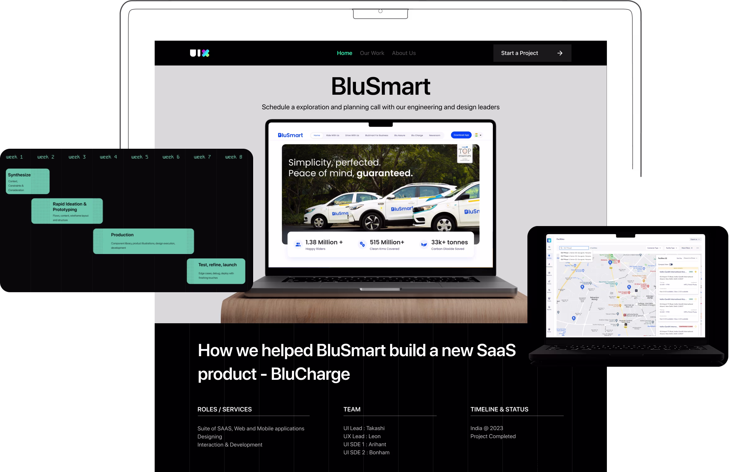
Case study page tempelate
Employee life cycle UX research
TIMELINE & STATUS
Completed
An internal web-app's dashboard, designed for clients to track the project and employees working on it. A case study landing page template, designed to be reused across all future and past works.
This dashboard was necessary because clients previously lacked real-time, in-depth visibility into project progress. It was also designed with future expansion in mind, as these clients often absorb employees from the firm for varying durations. The team members working on the project typically have the deepest understanding of it, making them the most suitable to support ongoing needs.
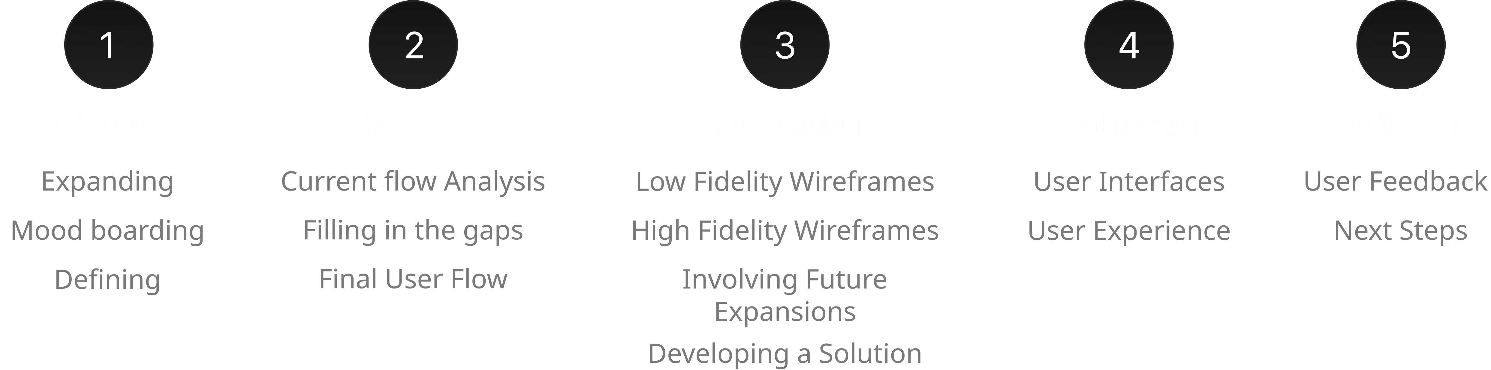
My role was to design the dashboard from scratch, focusing only on the employee tracking section, as other features were to be added later based on requirements. I conducted thorough user research to understand the client's pain points and what they wanted to see in the dashboard. On the second hand, the case study page template was designed for reuse across both past and future projects, so I ensured it was user-friendly and followed a consistent design language with the rest of the website. Extensive moodboarding and multiple iterations were done to arrive at the final designs.
THE HIGHLIGHTS
USER RESEARCH
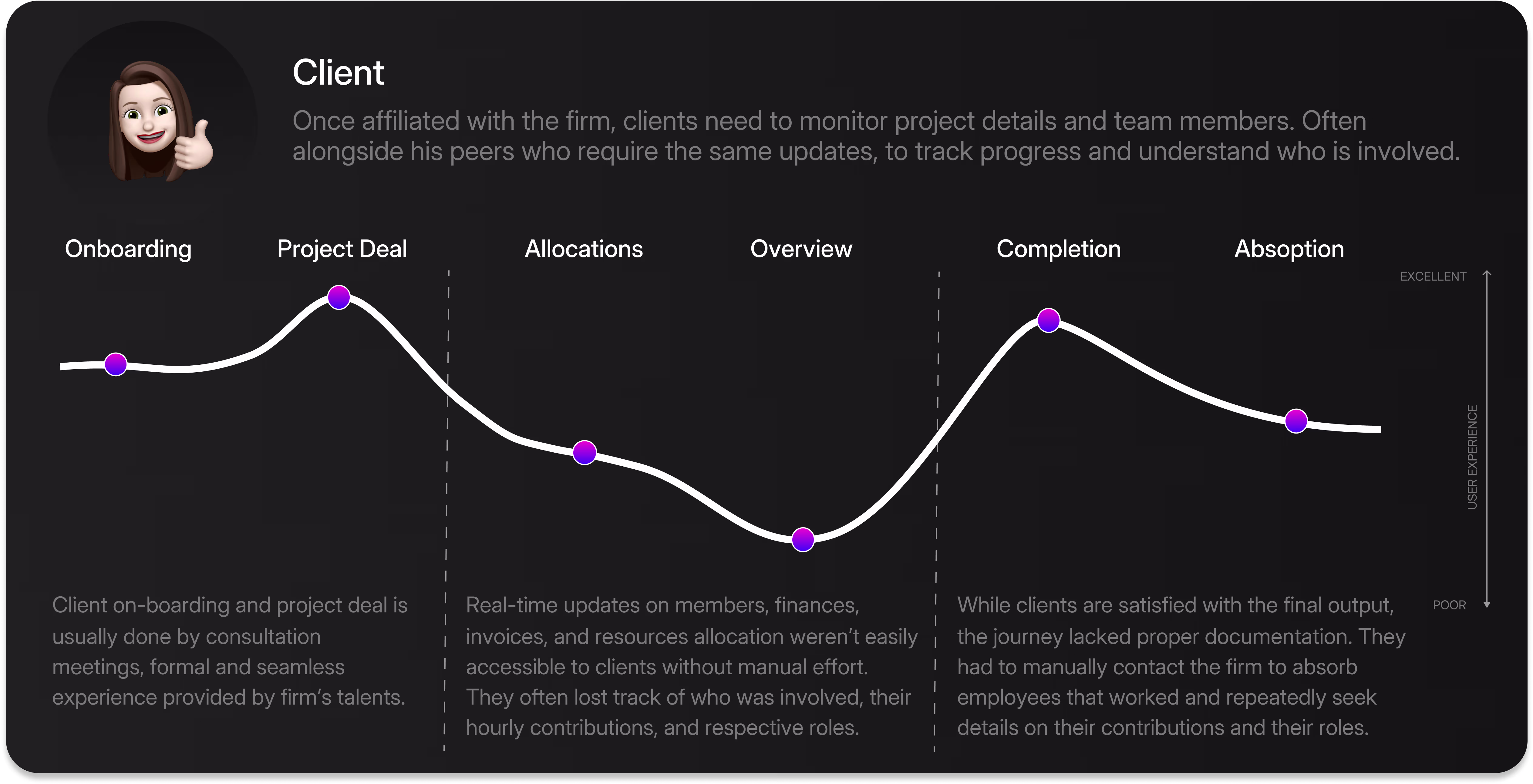
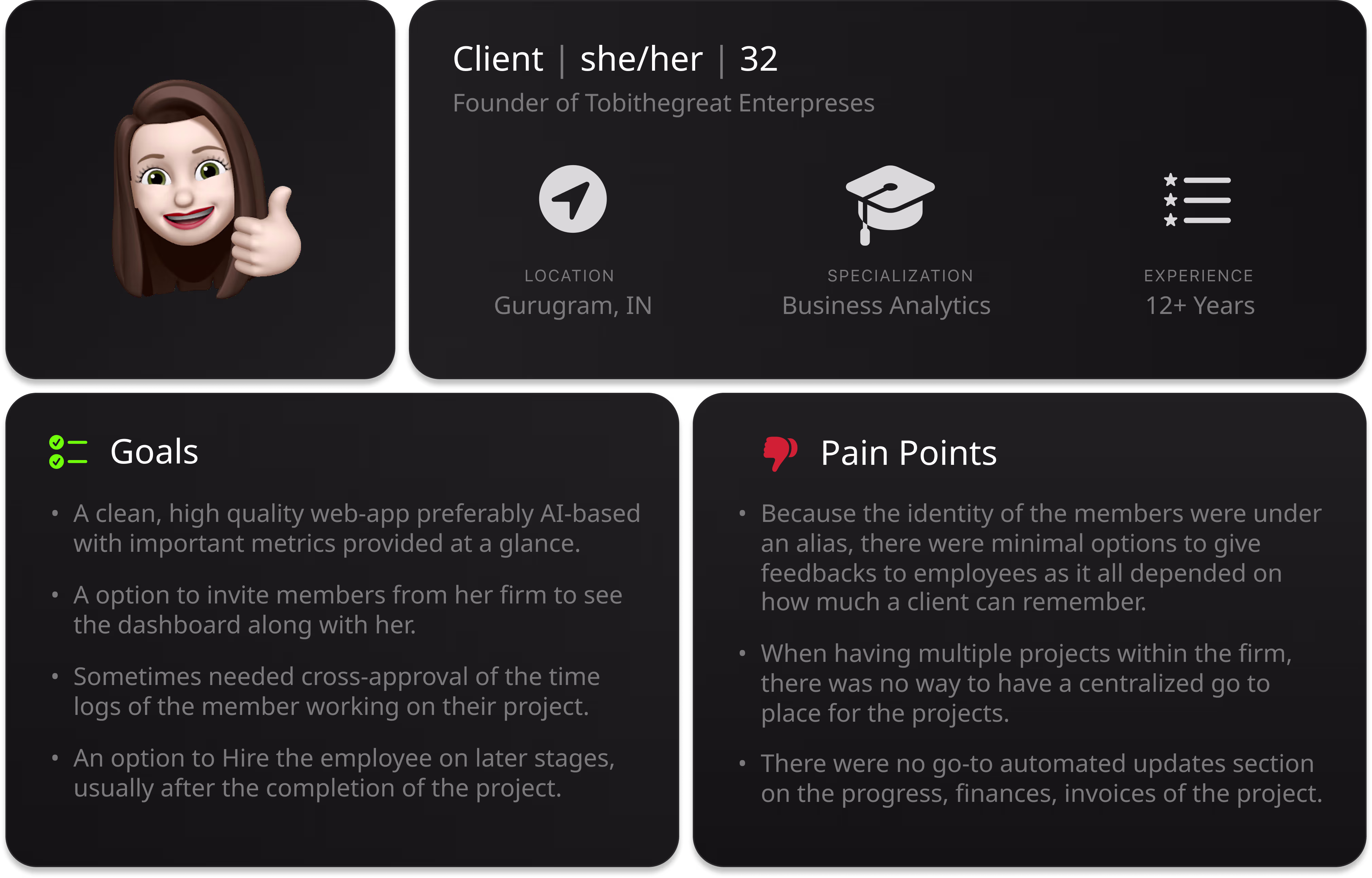
The firm follows a time-logging system, allowing members to work flexibly outside of scheduled meetings, provided their hours are logged. During my internship, this process was still being managed via Google Sheets. However, discrepancies often arose, especially with new members and interns, whose logs needed closer monitoring to prevent misuse. This created a need for role-based access, typically granted to a senior team member familiar with the project. In some cases, the client company also requested access for cross-verification. A proper system was required to document, store, and manage time logs, with clear approval controls in place.
THE PROCESS
Due to a Non-Disclosure Agreement, most internal processes and details cannot be shared. However, select wireframes that represent the web app's journey are showcased below.
During the expansion phase, our core focus was to create a seamless experience. It was decided that both a mobile app and a web app would be developed simultaneously by separate teams, with some shared members to ensure interconnectivity. As my team was still being formed, the wireframes below represent my initial concepts for the mobile app.
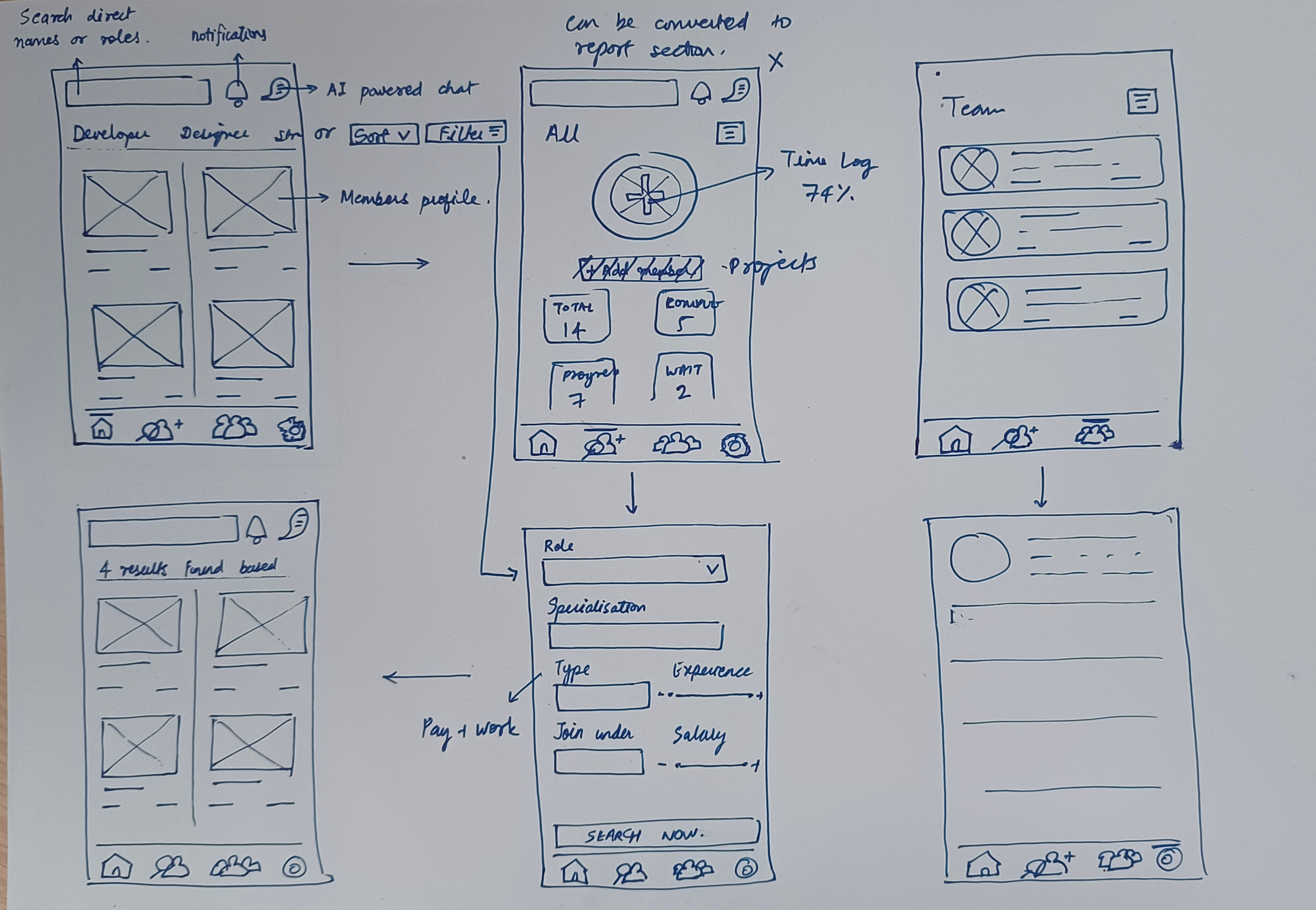
Now, looking at the above wireframes, I was eventually asked to shif the focus on the web app (just kidding, a designer was already assigned to the mobile app). These wireframes were created at a very early stage, before any user research had been conducted, and served purely as foundational concepts.
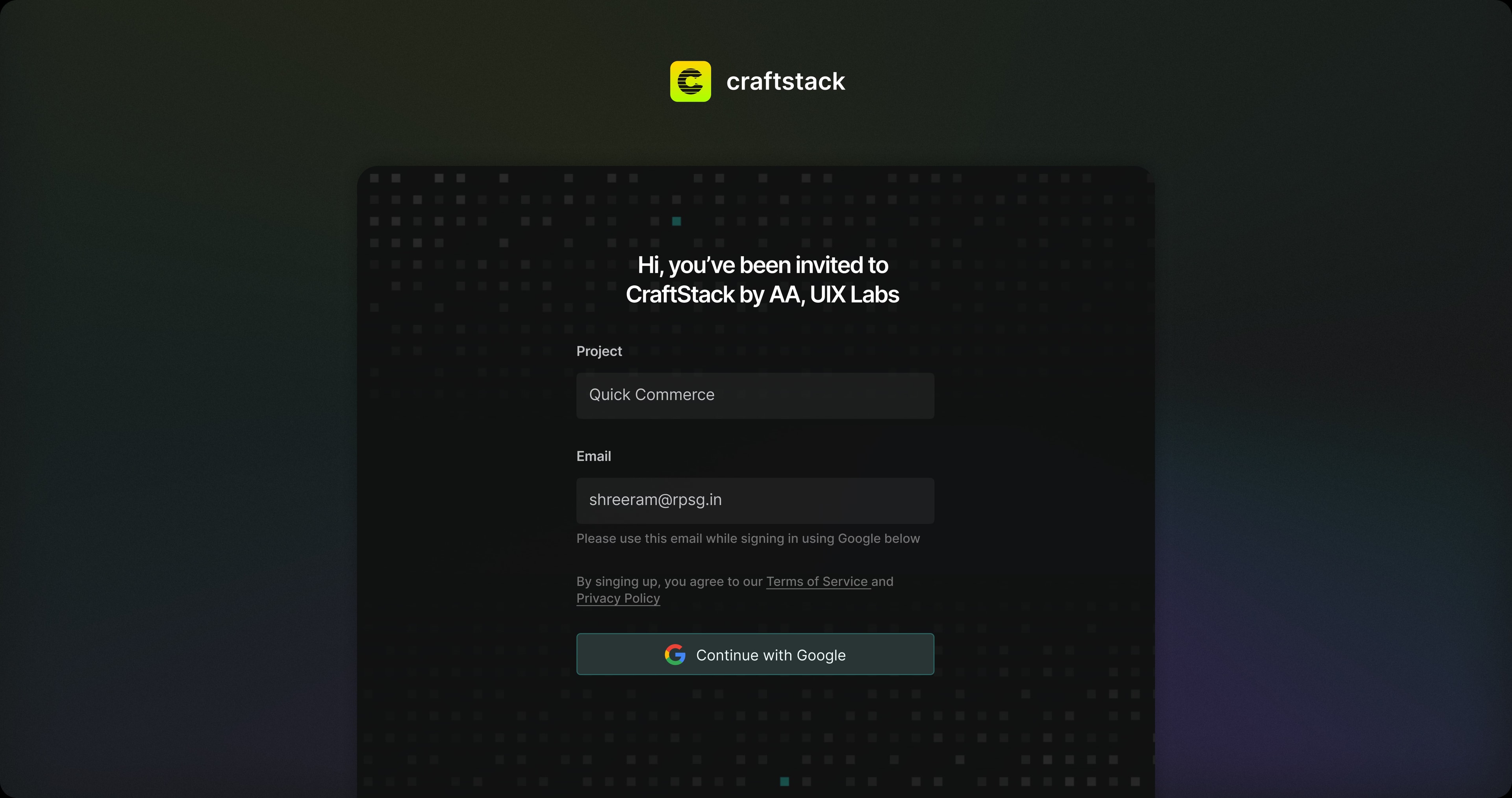
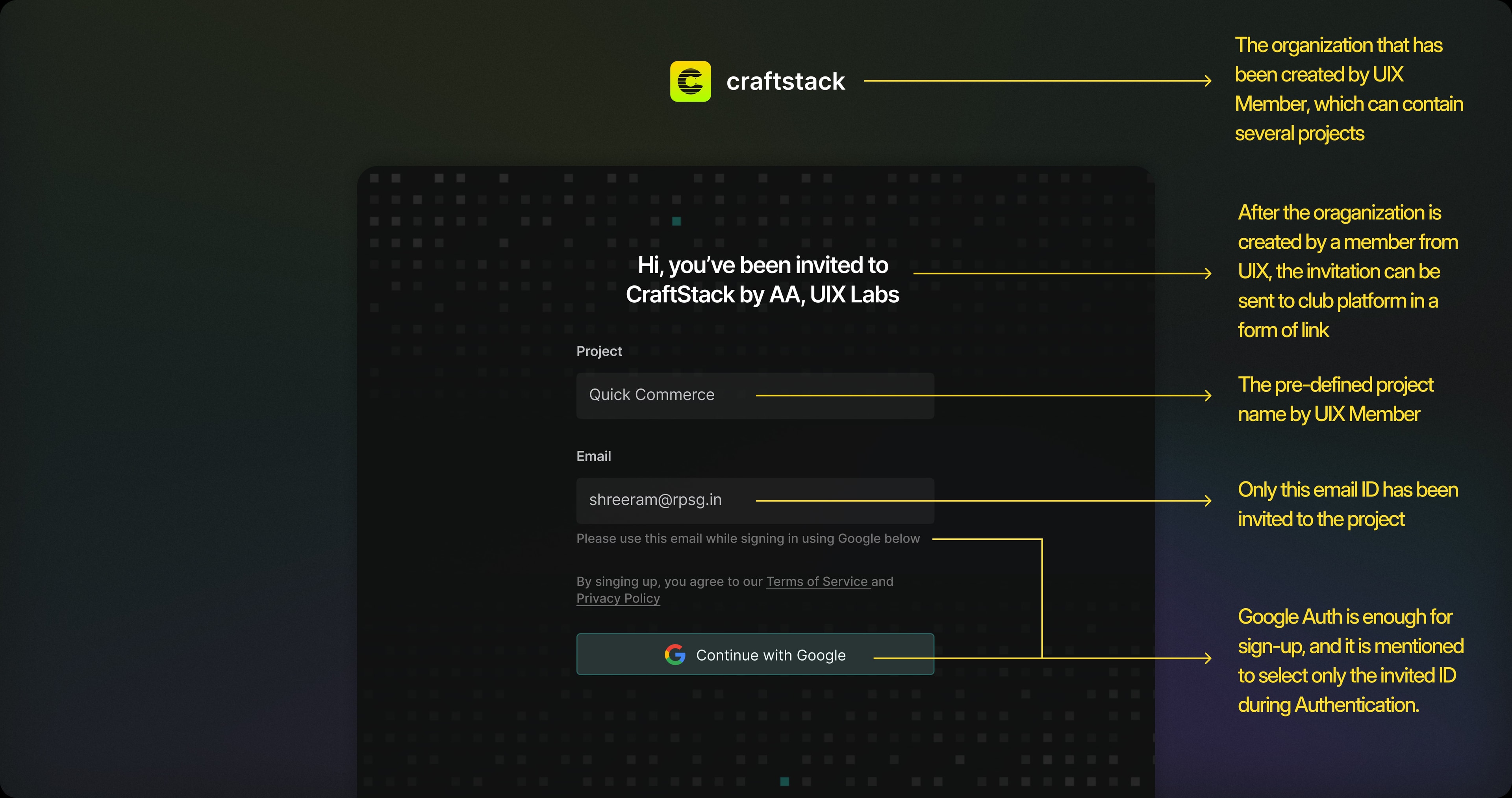
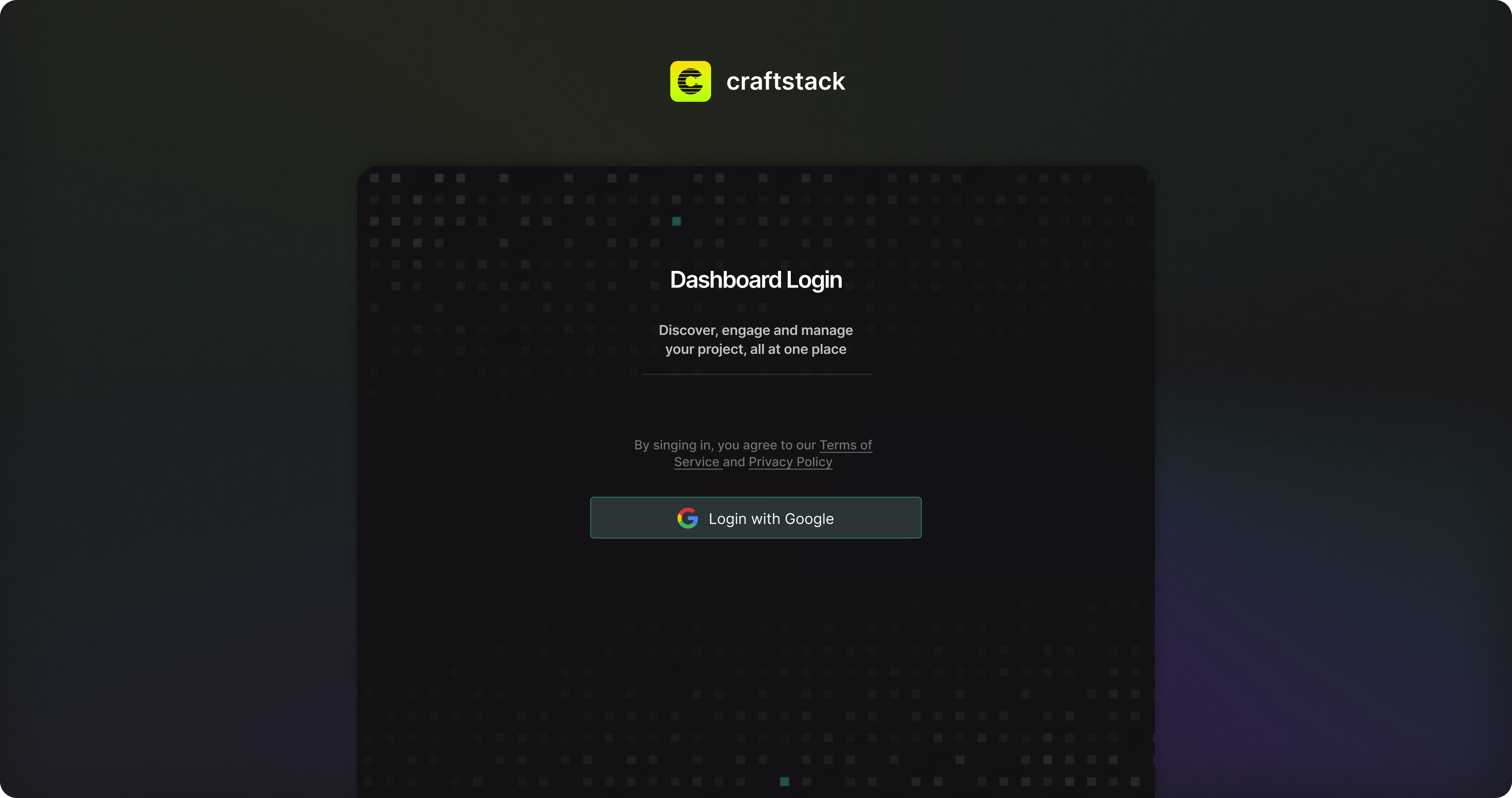
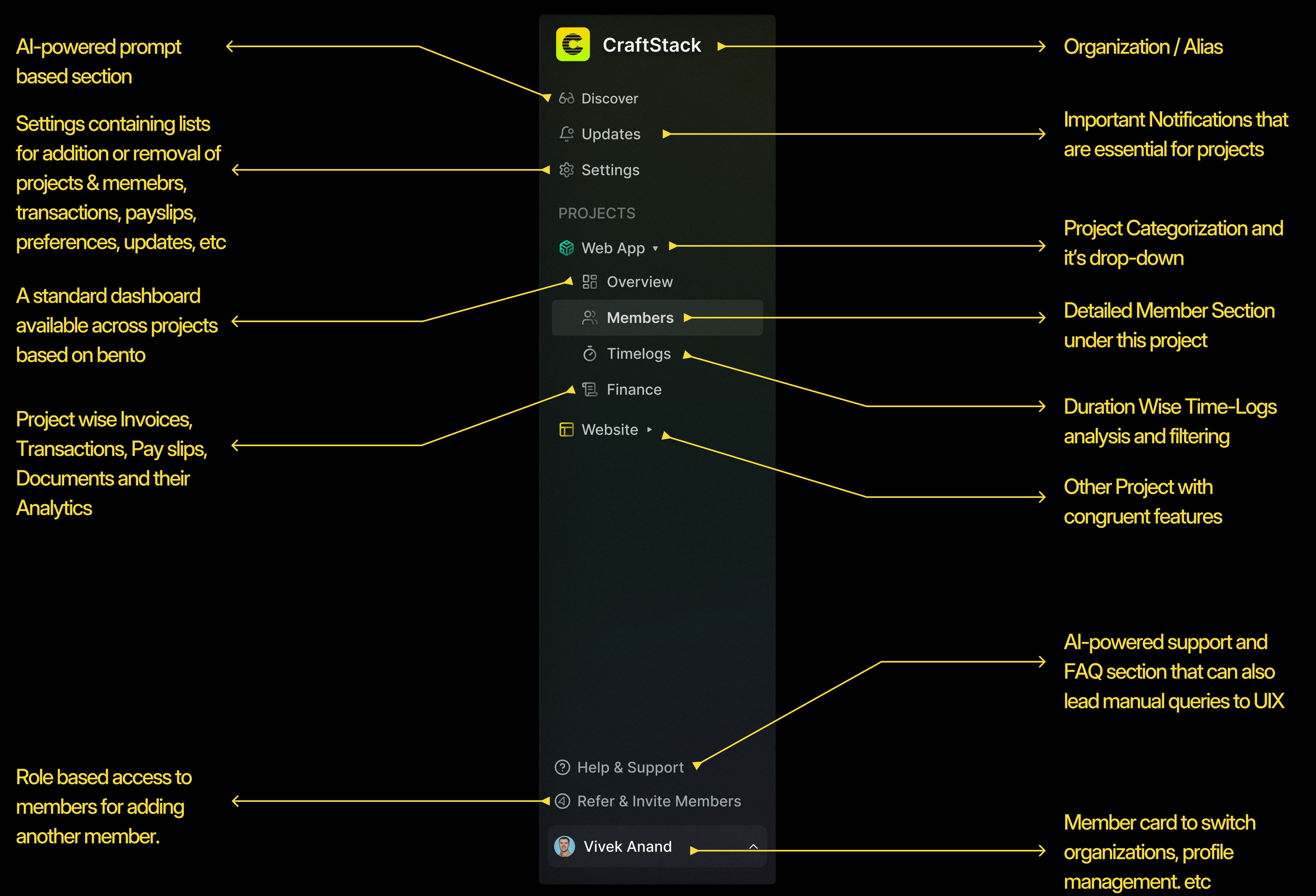
In terms of design thinking, the process will begin every time with a senior member from UIX Labs, already present on the club platform, creating the project and filling in all essential initial details to kickstart it. Additional members could only join the project through invitation. The UIX lead would send an invite to the affiliated company's email ID, add them to the project, and assign them a role. Depending on their role, they could then invite other members as well.
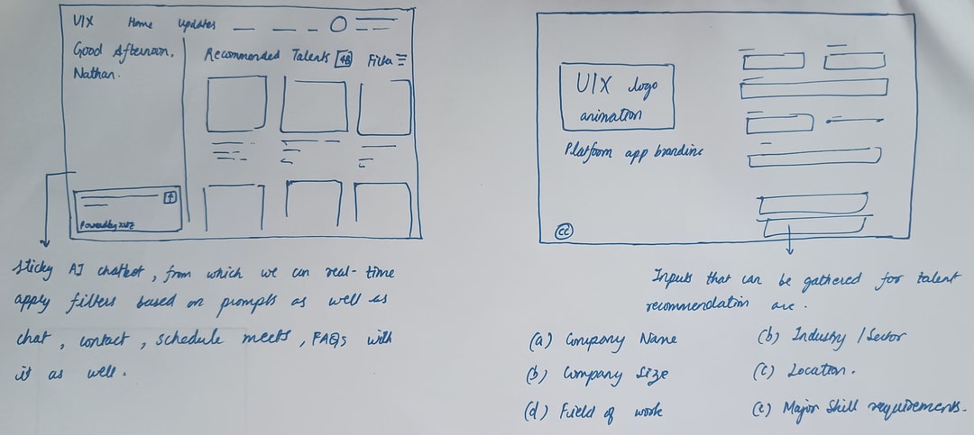
At this stage, it was decided that the landing or hero section of the web app for clients would be a Discover section. This section would function as a dynamic, prompt-based interface, capable of delivering data analytics or insights related to the project. Powered by natural language processing, it would translate user prompts into database queries and generate accurate, real-time dashboard results.
Example 1: Show me the members in the project working on web development with a monthly pay under ₹1 Lakh.
Example 2: Show me the weekly synopsis of the project, including team efficiency and total hours contributed by all members.
The inspiration moodboard is shown below
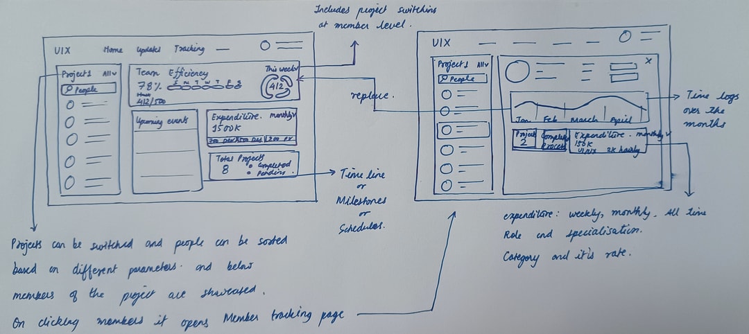
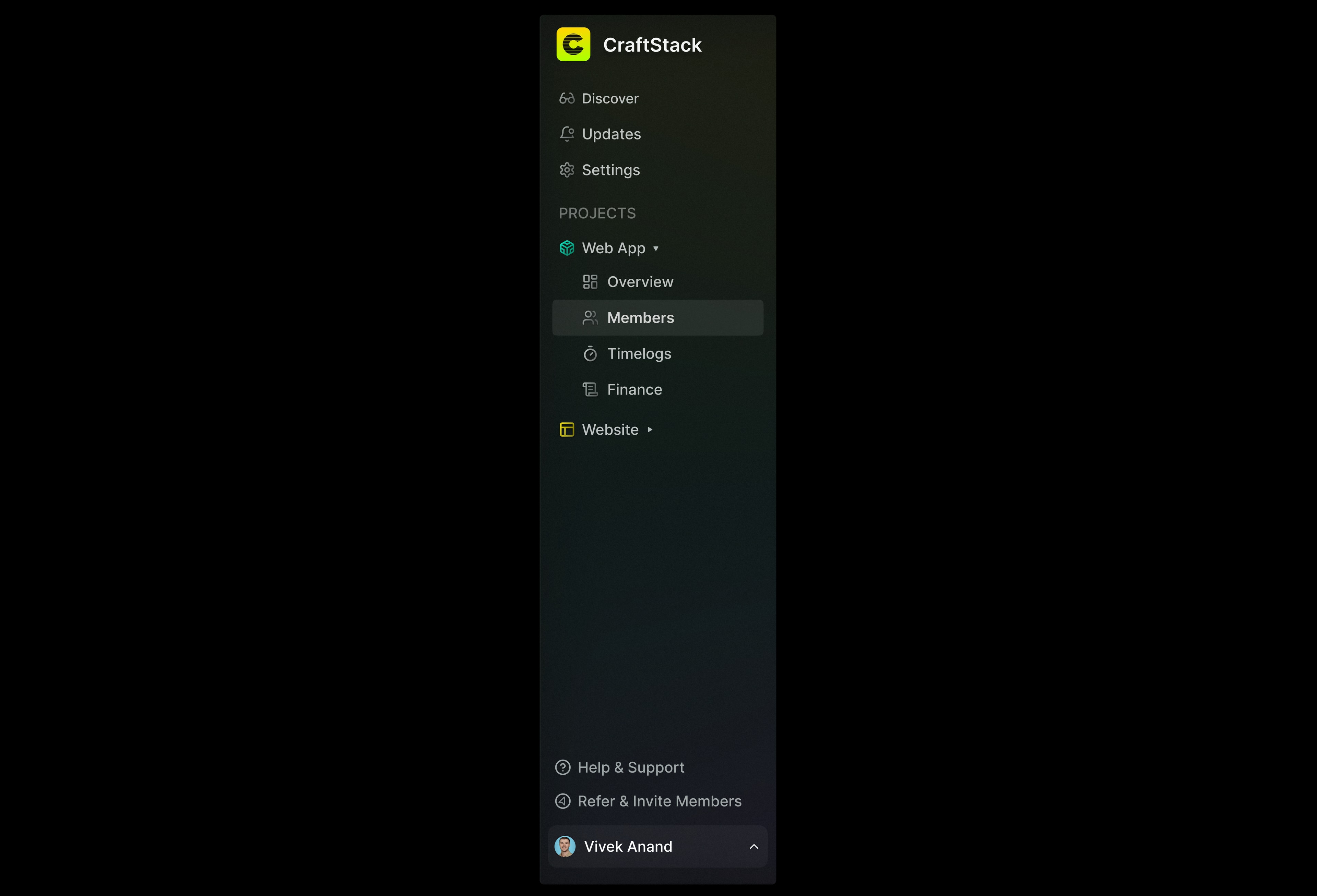
There were several other high-fidelity wireframes involved, but considering the complexity of the application above, I was advised to focus on the Members section for now. The other sections can be added later once the foundation is properly laid. But defining those sections beforehand was necessary.
WEB-APP DESIGN
Here, only a limited number of screens can be shared here since it's an internal app of the firm, but they should give you a clear idea of the web app's design and overall structure.
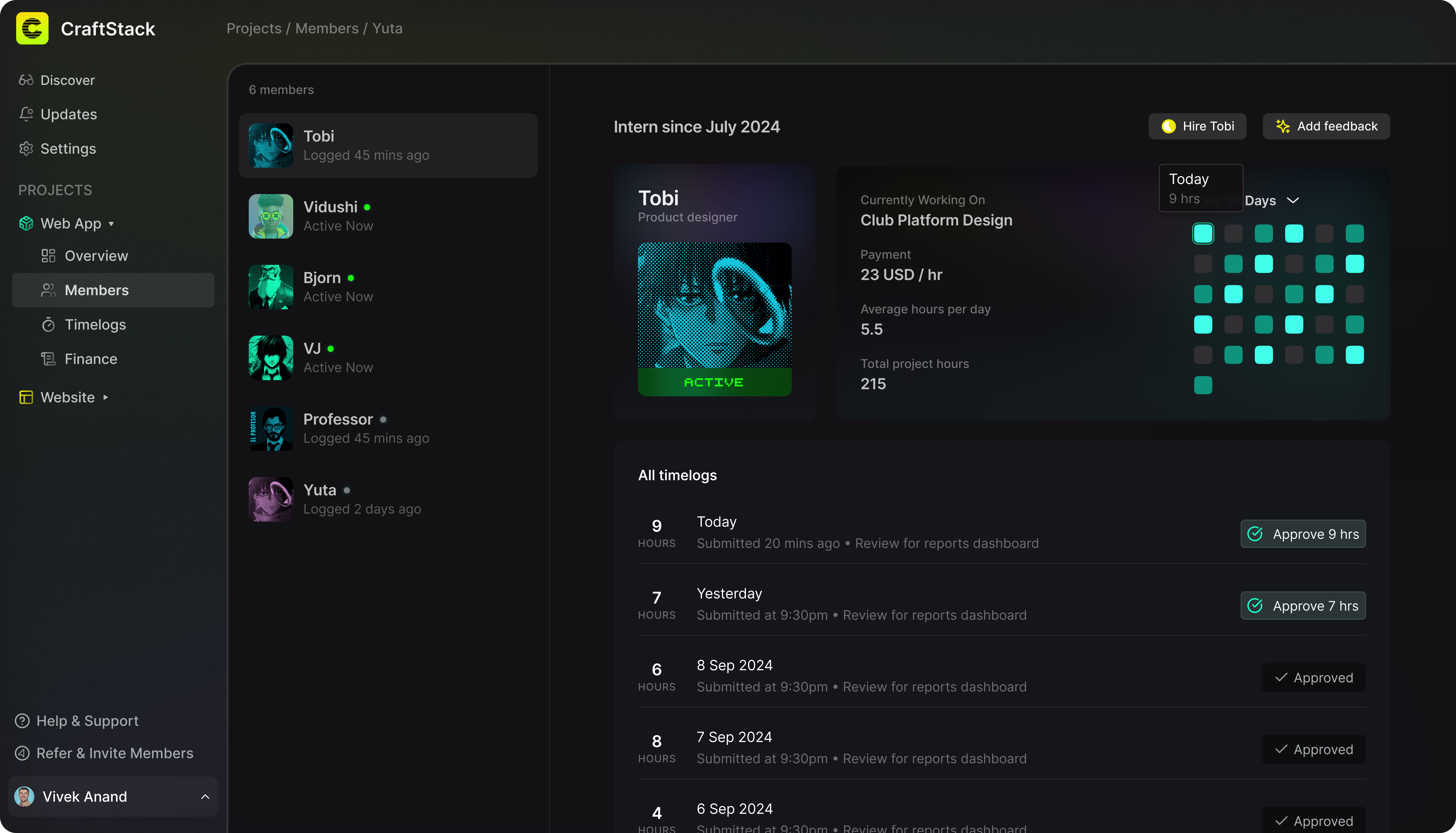
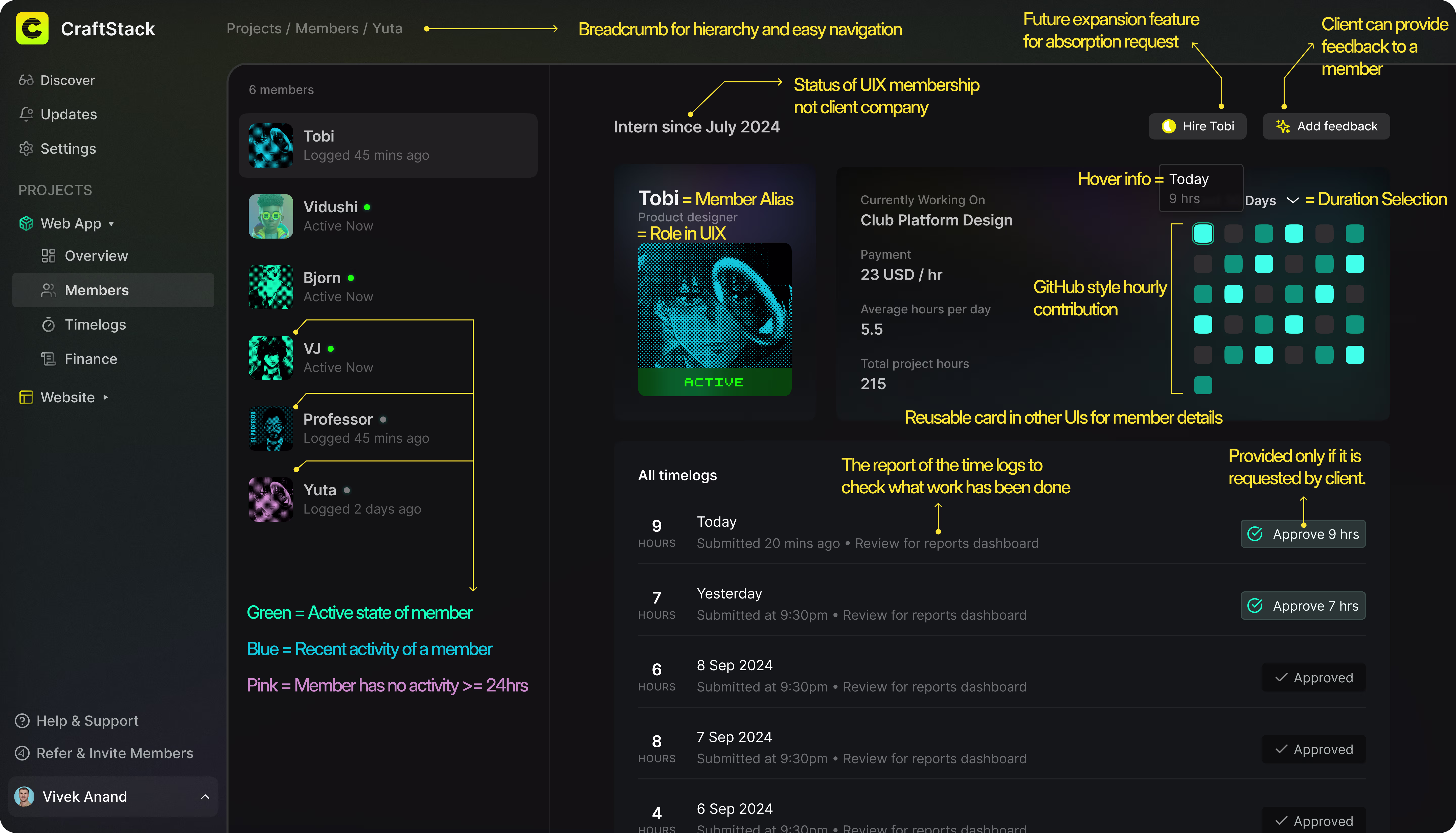
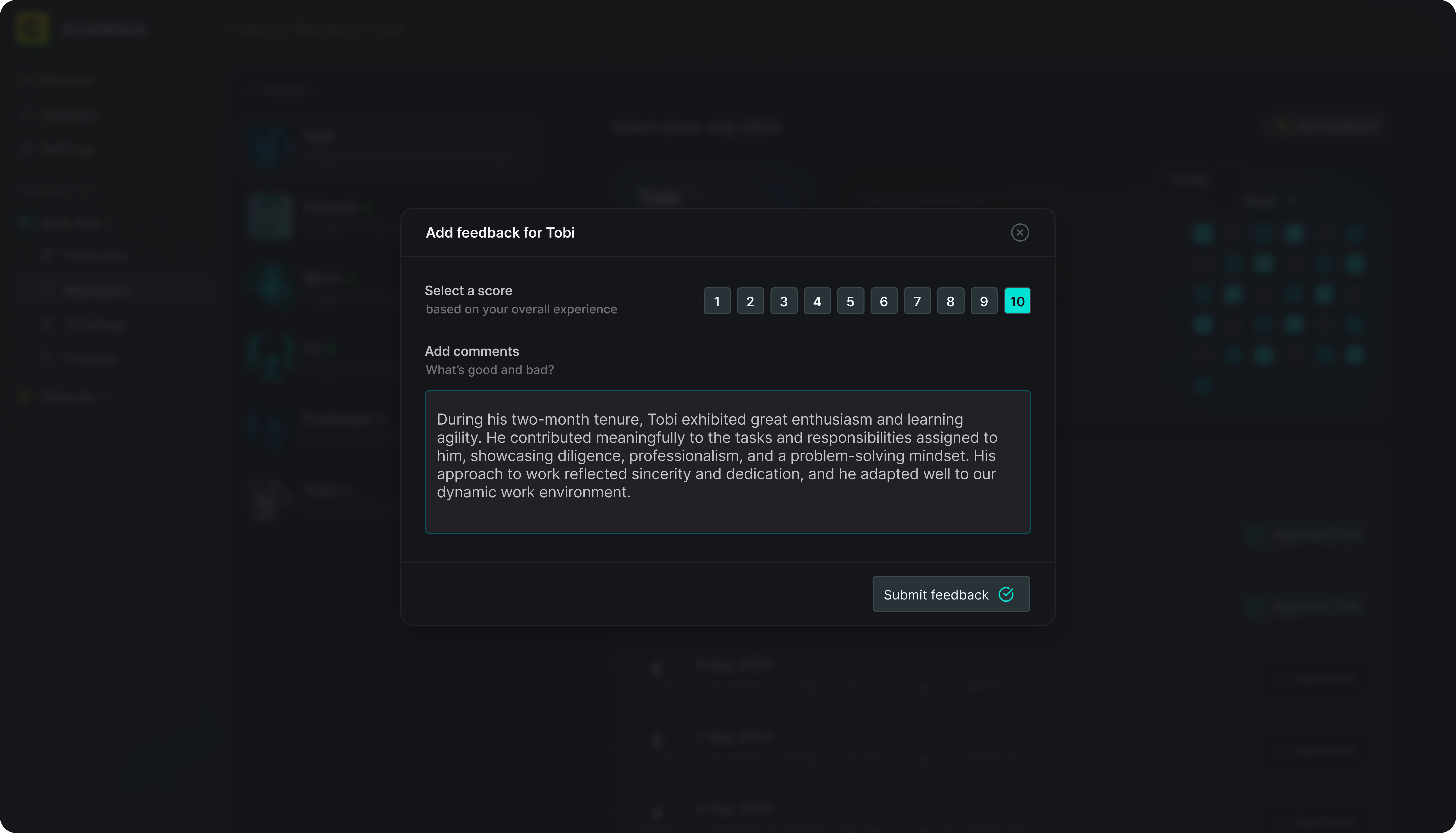
Now, you might be wondering where is a essential feature like messaging with members. While they can be easily integrated, as shown in the image, with a UI similar to Gmail or Facebook messaging, they were intentionally excluded from this early version based on a decision made by the higher-ups. Similarly, aliases are used instead of names because of security purposes.
CASE STUDY TEMPELATE DESIGN
To keep the process simple, I began with a basic moodboard that guided me while designing the case study template.
It took four iterations to get it finalized, as the goal was to create an extremely reusable template, the one that wouldn't require any significant manual effort. Click below to view all four iterations.
While going through these iterations, do keep in mind that I didn't get to fully complete any single version. I was consistently asked to transition into newer designs as new goals were introduced, hence the multiple iterations. The evolution reflects a journey: from an early Notion-inspired aesthetic, to progressively enhancing the quality of mockups and detailing, and finally, to striking the right balance between various stakeholder needs.
Contact me to create fun things together
VERSION
2025©Edition
LOCAL TIME
IST
SCORE
0
SOCIAL MEDIA